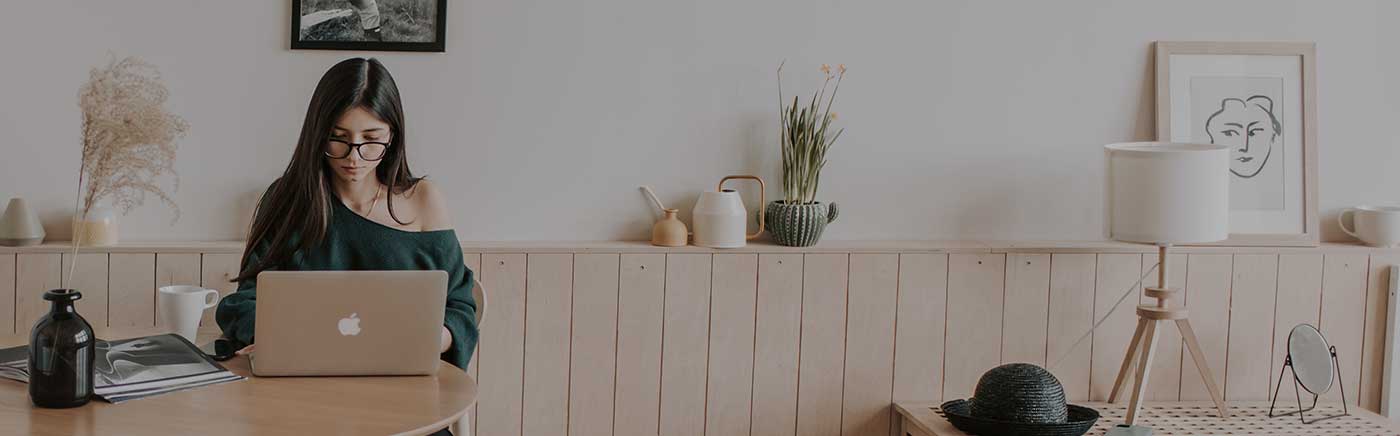
 Keep your home running smoothly year-round. Central heating checklists and boiler safety to plumbing fixes and electrical tips, we provide the practical advice every homeowner needs to prevent costly repairs.
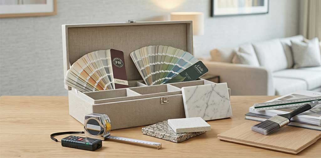 Transform your living space with our expert guides on flooring, painting, and kitchen renovations. Learn how to clean delicate surfaces like marble or choose the right fixings for your next big indoor project.
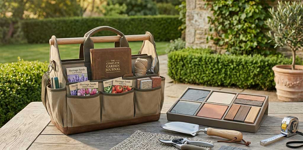 Enhance your curb appeal and enjoy your outdoor space. Discover the best lawnmowers for your garden, landscaping inspiration, and durable solutions for fencing, patios, and home exterior maintenance.
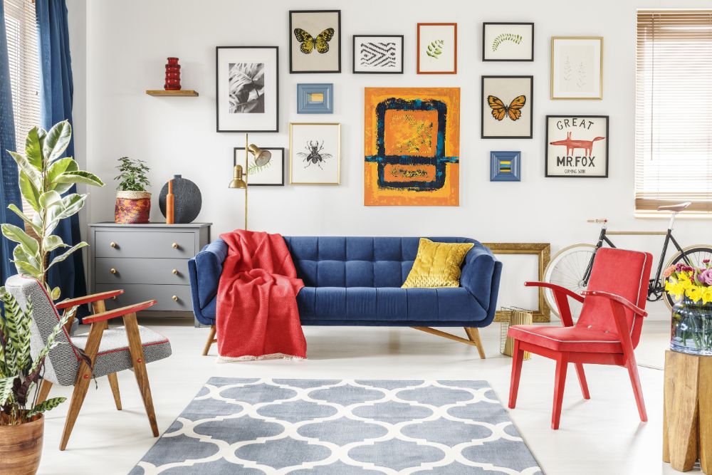
This summer is the time to repaint a stale interior with dramatic, moody colours, whether you live in one of the new homes in Darlington or an older property.
The last few years have seen neutral tones dominate the interior design world: warm browns, muted versions of bolder shades, and white walls as far as the eye can see. Now it’s time for colour to make a comeback, bringing some emotion and impact back into our homes.
Whether it’s your bedroom, kitchen, or entire home that needs a refresh, inspire yourself with this list of summer’s hottest colour trends.
Layered tones
Colour; drama; impact. To some, these words are exciting, to others, they bring a sense of dread. What about refinement? How can bold colours ever be considered elegant?
The answer is tone-on-tone colour palettes. Decorating your dining room or living room in colours from the same family is an effortless way to make the space appear chic and sophisticated, as well as interesting.
Play with different textures, materials, and patterns in similar shades to create a cohesive yet impactful interior.
Earth shades
Earth tones are a continuation of the neutral palettes which have proven so popular in recent years, though with additional warmth and variation.
While cooler nature tones like grey are falling out of fashion, warmer browns and creamy tones are finding favour with many of the world’s leading interior designers. This is particularly true in rooms which look out on gardens, as a green view and shifting natural light are the perfect complement for earth tones.
Earth shades can be given further richness by bringing touches of muted green or rusty red to the palette.
Green as a base
Traditionally, base tones tend to be neutral tones, such as black, white, or cream, but this summer it is green which is taking its place as the building block of our décor.
This is due to how versatile a tone green is, able to be either eye-catching or demur depending on the shade. A deep forest green can read as black on first glance, whereas a pale mint green can read as white, yet they are much more interesting visually, and can be built upon using various complementary shades for a rich and striking interior.
Contrasting red and blue
Colours behave in different ways and evoke different emotions from us.
Red and blue stand on opposing sides of the emotional colour spectrum. Red excites us; blue calms us. Red provokes strong feeling; blue provokes contemplation. But it is precisely this contrast which makes them such an impactful colour combination.
They are also both colours of enormous variation, so do not hesitate to experiment with different shades to create different impressions. Mix cobalt with deep crimson for a calm, stimulating study space, or Mediterranean blue with scarlet for a bright, invigorating kitchen.
Whatever shades you choose, a good rule to follow is to make blue the dominant shade and save the more overwhelming red for the accents and accessories.
Soft pinks
The days where pink walls were only found in the bedrooms of little girls are long over. This summer, stylish and sophisticated powder pink is here to elevate your interiors.
Soft mauve, dusty pink, and pinks with a touch of brown in them are a subtle and elegant alternative to more vivid hues, and can be paired with a wide range of other colours – gold, grey, forest green – for maximum impact.
Moody colour
For the truly daring, there is one colour that has an impact like no other: black.
More and more designers are turning to black as a dominant shade. If used well, a softer, peppery shade of black on the walls of a dining room can create a moody, inviting, and timeless space.
The colour trends of summer 2024 are all about mood and emotion, so don’t be afraid to express yourself with your colour choices.